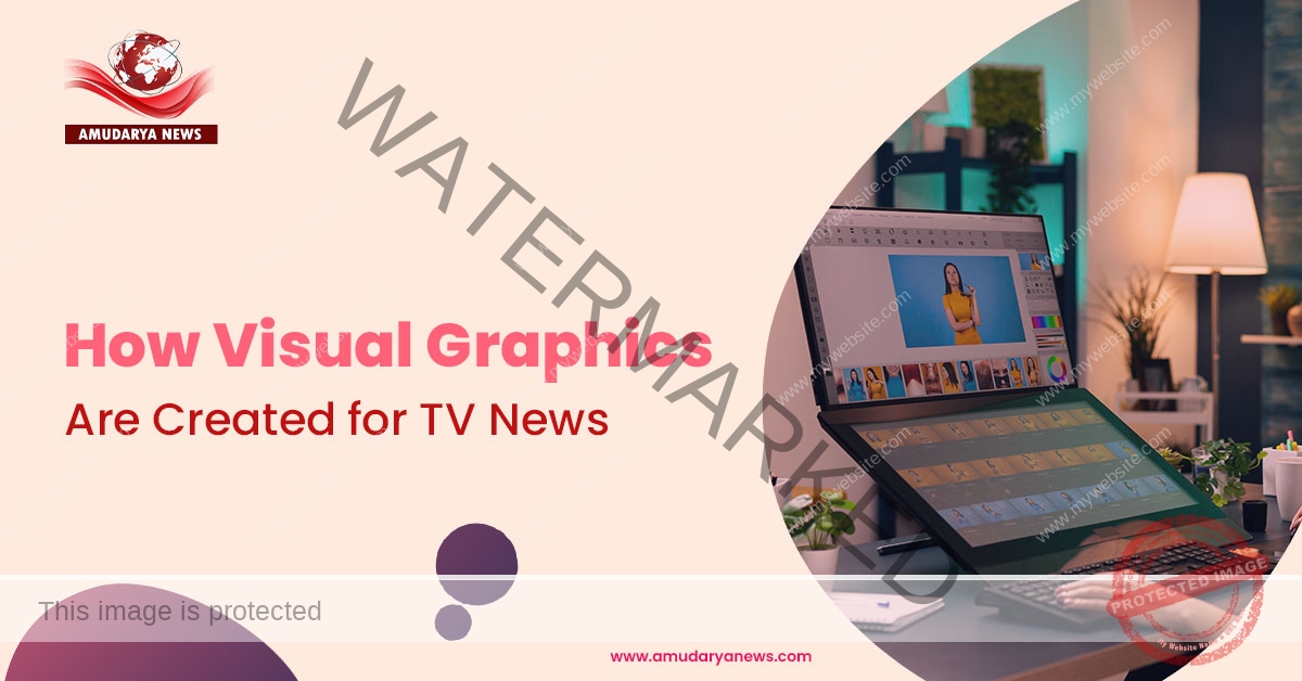
When you watch the best news channel, what often grabs your attention first isn’t just the news anchor; it’s the visuals on the screen. From breaking news banners and scrolling tickers to animated maps and weather updates, visual graphics play a huge role in how news is shared and understood. These graphics help viewers quickly catch important details, even when the news is moving fast.
Have you ever wondered how these clean, professional visuals are created behind the scenes? Let’s take a closer look at how TV news graphics come to life and why they matter so much in today’s broadcasts.
Why Are News Graphics So Important for Viewers?
At its core, a news broadcast is about communication. Turning information into something easy to understand right away. In our fast-paced world, people don’t always have time to listen to long explanations. Graphics help show what’s happening at a glance, and that’s why modern news has moved beyond just text or static images.
Today’s viewers expect dynamic visuals that make sense instantly, whether it’s a graph showing rising temperatures or an animated map showing the path of a storm. Seeing this on screen helps people feel more informed and connected to what’s going on around them.
Every Graphic Starts With a Story
Before any graphic gets made, the news story itself comes first. When an editor or producer decides what’s going to air, they also talk about how visuals can support that story. Some stories naturally call for graphics, for example:
- Weather updates benefit from animated maps.
- Elections are easier to follow with data charts.
- Traffic or local events might need location markers or icons.
The point is to match the visual to the story so viewers can understand quickly without waiting for a long explanation.
Designing Graphics With Viewers in Mind
Good news: graphics are not made by guessing; they’re made by thinking like the viewer. Designers and producers ask questions like
- What does the viewer need to know first?
- How can this information be shown clearly?
- Can the graphic make the message easier to absorb in seconds?
The goal isn’t to overwhelm with animations but to guide the viewer’s eye to the most important information in a simple way.
Creating a Clean and Professional Look
Once the story and information are clear, the creative part begins. Designers work on the look and feel of graphics. This includes choosing:
- Colors that match the channel’s style
- Fonts that are easy to read
- Layouts that don’t crowd the screen
Every graphic must feel like it belongs to the channel’s brand and flow smoothly with the rest of the broadcast.
Templates That Save Time and Keep Things Consistent
In busy newsrooms, there’s no time to build every graphic from scratch. Instead, teams use templates, pre-designed graphic packages that can be easily updated with new information. These templates include things like
- Lower-thirds (the names and titles you see on the screen)
- Tickers (the scrolling text at the bottom)
- Weather visuals
- Data charts
Using templates helps ensure brand consistency and makes it possible to get high-quality visuals on air even under tight deadlines. With the right tools, these templates can be updated with real data in seconds, saving time and effort.
Turning Live Data Into Clear Visuals
One big piece of modern news graphics is real-time data. For weather, election results, or sports scores, the information is constantly changing. Graphics systems today can pull this data automatically, so what you see on screen updates instantly without manual changes.
For weather graphics, data from meteorological sources is processed and shown with visual elements like maps and icons. For elections, vote counts can appear and rise live on screen. This real-time integration keeps the visuals accurate and meaningful.
Motion and Animation That Helps Tell the Story
Static images have their place, but animation takes visuals a step further. Simple movement, like a ticker sliding in, a chart growing, or a map zooming, helps the viewer’s brain follow the flow of information more naturally than static pictures.
Good animation doesn’t distract; it guides attention. That’s why designers think carefully about how and when to animate so that it supports the story rather than taking focus away from it.
Working Together Behind the Scenes
Creating news graphics isn’t a one-person job. It’s a coordinated effort involving:
- Journalists (who decide what story is happening)
- Editors (who shape the narrative)
- Designers (who create the visuals)
- Producers (who put the show together)
Everyone has to work together quickly and accurately so that when the news airs, the graphics feel like a natural part of the broadcast.
Balancing Creativity and Accuracy
One of the trickiest parts of news graphics is balancing creativity with accuracy. The visuals need to be eye-catching, but they also must be correct and trustworthy. Misleading graphics can create confusion or misinterpretation, so accuracy is always the top priority.
This means that even as graphics are made to look appealing, the underlying information must be verified and presented clearly.
Templates or Custom Graphics: What Works Best for News?
Some graphics are fully custom, like a unique animation for a major event. Others come from flexible templates that let designers plug in data quickly. Templates are especially helpful for repetitive elements like weather, daily headlines, or sports scores.
This mix of custom and templated work helps newsrooms stay efficient while still delivering meaningful, unique visuals when needed.
Adapting Graphics for Different Platforms
It’s not just TV anymore. News graphics need to work on mobile phones, tablets, computers, and social media, too. That means designers think about different screen sizes and how graphics can adapt to each format while still looking great and readable.
Mobile users might see simplified versions of visuals, while TV viewers see the full layout. The best graphics teams plan for all these versions so viewers get a seamless experience no matter how they watch.
Graphics That Build Trust and Brand Identity
Consistent visual style helps build trust. When viewers recognize the style, colors, and layout, they feel like they’re watching a trusted news source. Visual identity goes beyond aesthetics; it becomes part of how a channel communicates its reliability and integrity.
A consistent look across weather graphics, ticker styles, charts, and studio visuals helps viewers feel connected and comfortable with the news source.
Why Do Graphics Make News Feel Modern?
Today’s audience, especially younger viewers, is used to instant, clear visual presentations from social media and online platforms. They expect the same clarity when watching TV news. Dynamic graphics help local and regional channels compete with big national networks by making their broadcasts feel just as polished and up-to-date as anyone else’s.
Modern tools and automation help even smaller newsrooms produce high-quality graphics that match the standards of larger broadcasters without needing huge teams or budgets.
The People Who Bring News Graphics to Life
Even with technology and templates, there’s a human touch behind every good news graphic. Designers add decisions about color harmony, animation timing, and layout balance that machines can’t do on their own. These creative choices shape how viewers engage with the story, whether the graphic feels calm or urgent, simple or detailed.
At the end of the day, visual graphics in news are about storytelling. They help break down complex topics into understandable pieces and support the words you hear from the anchor. That combination of sight and sound makes the information stick.
Final Thoughts
Visual graphics make news easier to understand, quicker to follow, and more engaging for viewers. From breaking updates to detailed weather and data visuals, these elements help turn information into clear stories people can connect with. When done thoughtfully, graphics build trust and keep audiences informed without confusion. This focus on clarity and viewer experience is what helps Amudarya News connect strongly with its audience every day.